Brand Identity
Gentle Giants Daycare
2024-2026

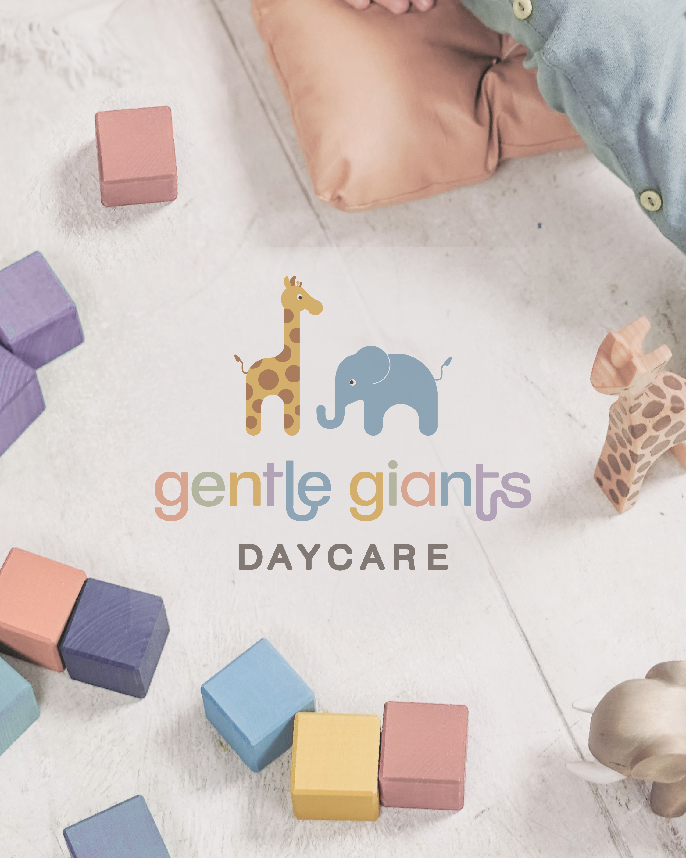
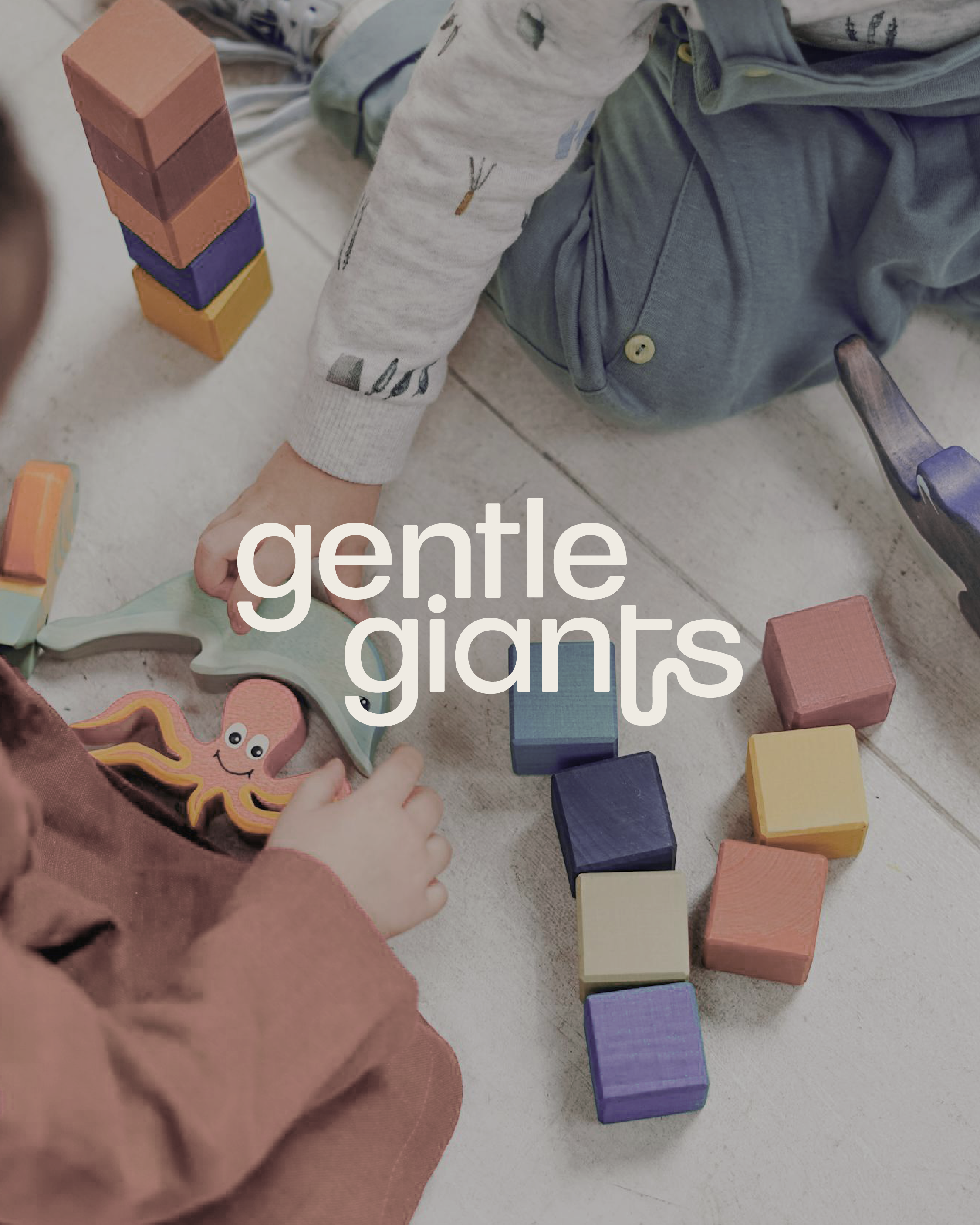
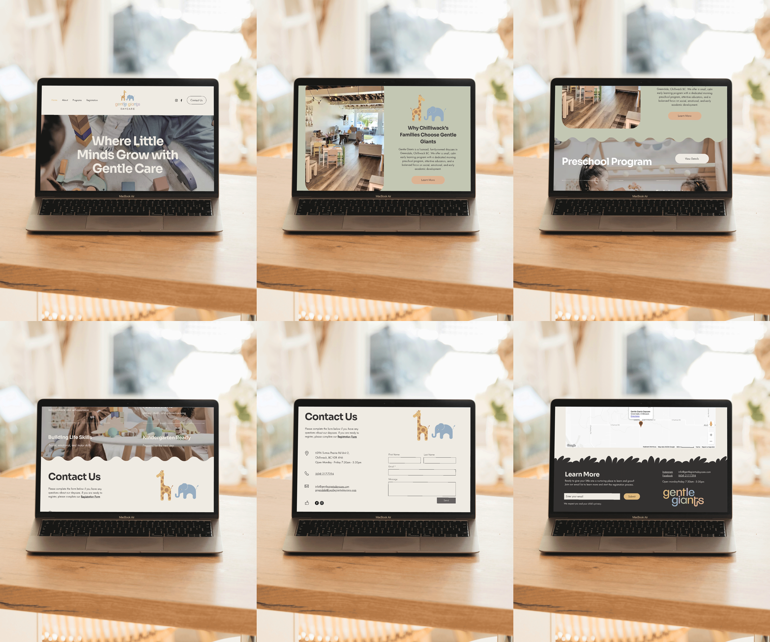
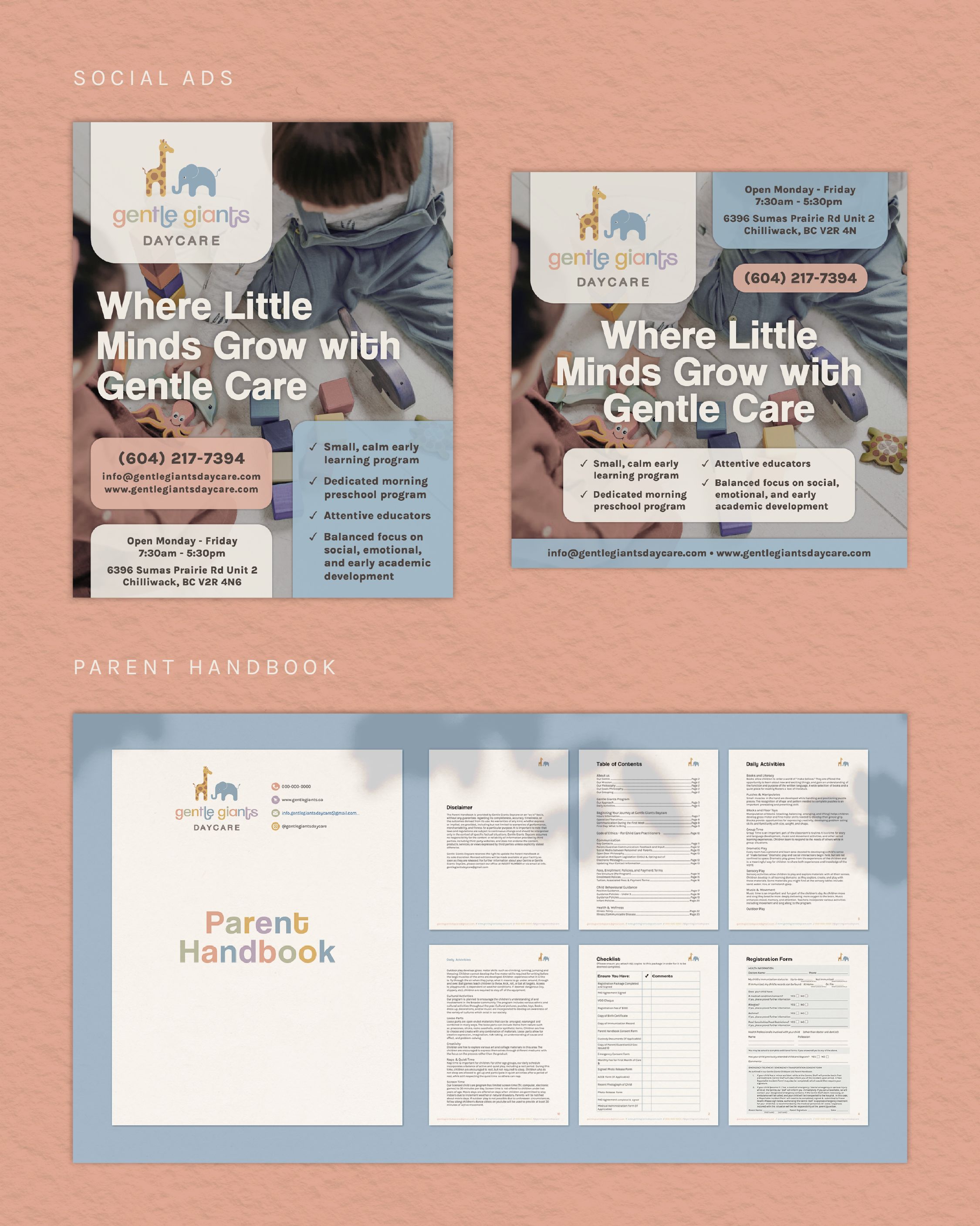
In early 2024, Gentle Giants Daycare asked me to create their brand identity and prepare the essential documents for their launch. Their brief was earthy and delicate, with the warmth of the care they give children built in.
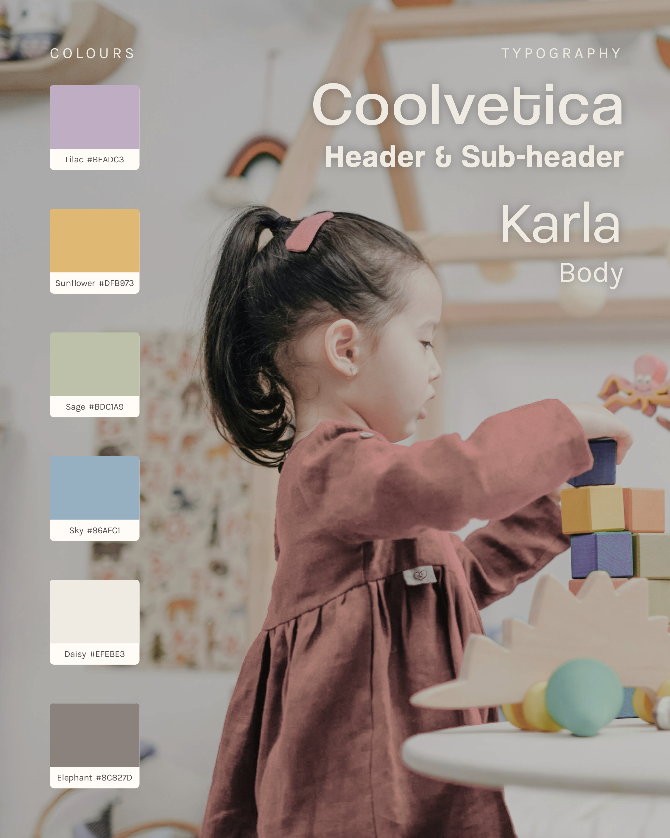
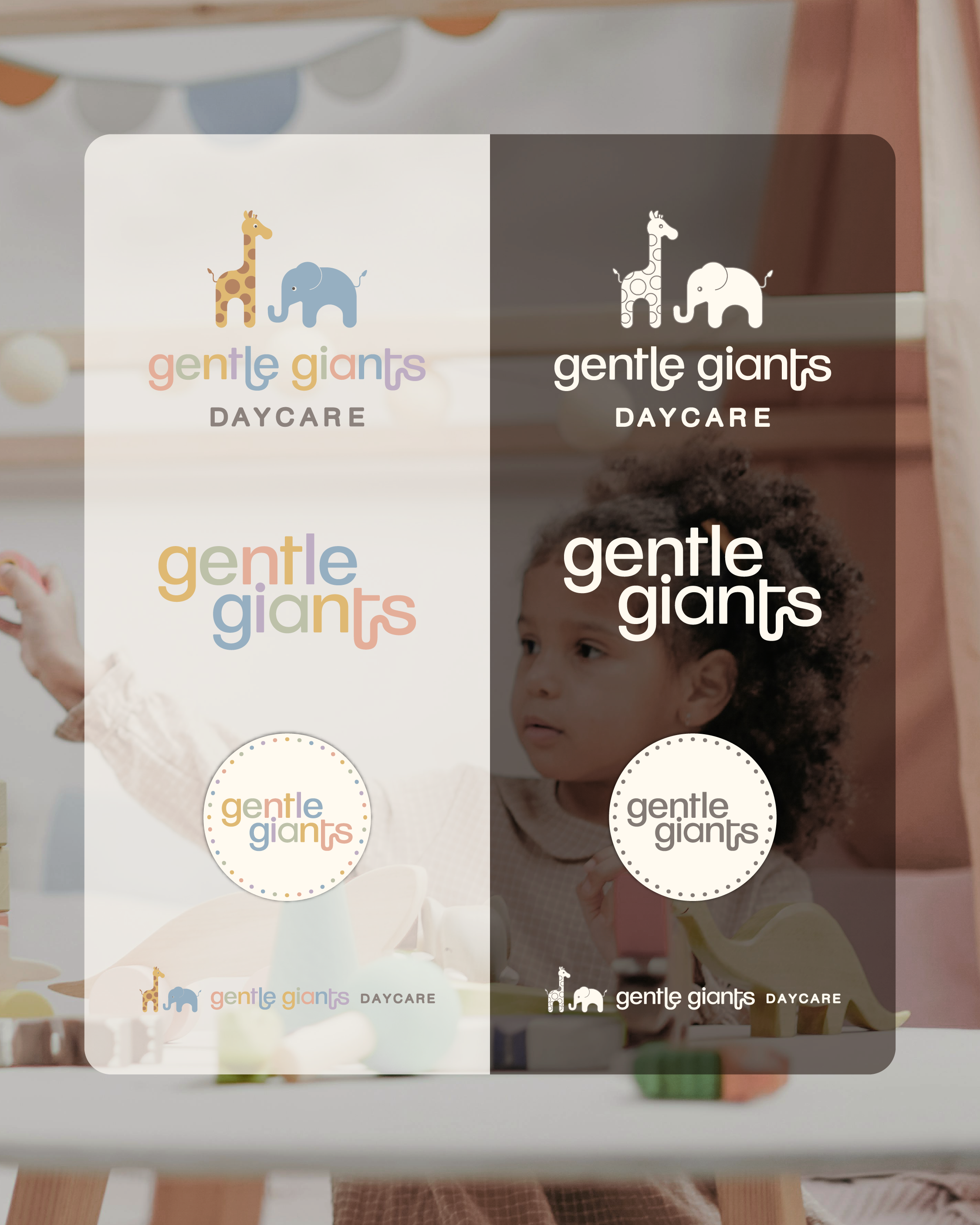
Most daycare brands lean on bright, bold colour. I went the other way, choosing a muted but colourful palette that evokes calm and sets Gentle Giants apart. The icons and logo are inspired by baby blocks, a nod to the early development at the heart of their care. Together they create a welcoming, serene space that still has enough life to engage kids, and reflect the daycare's commitment to structured growth and thoughtful care.
Embolden Counselling
2023

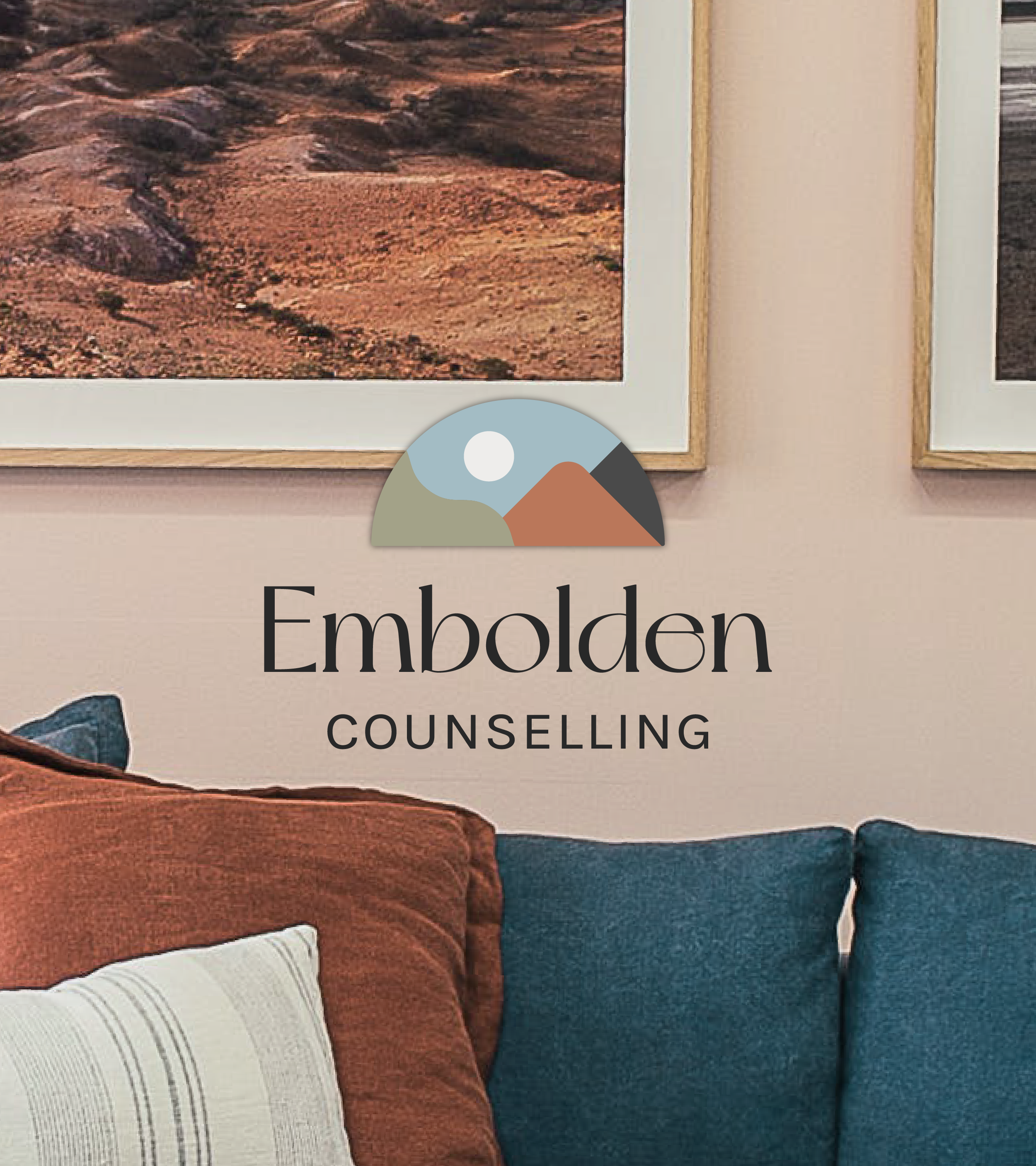
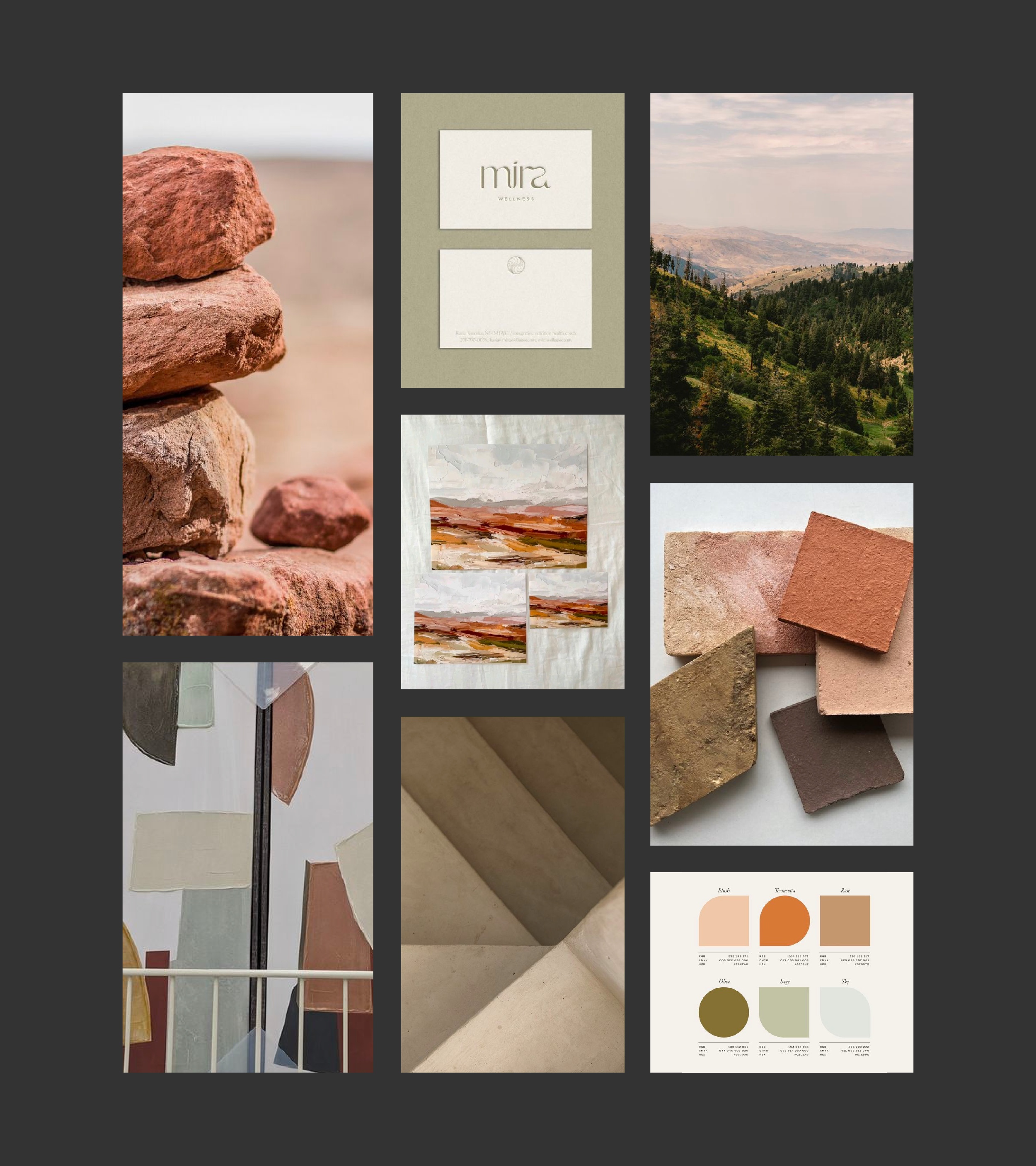
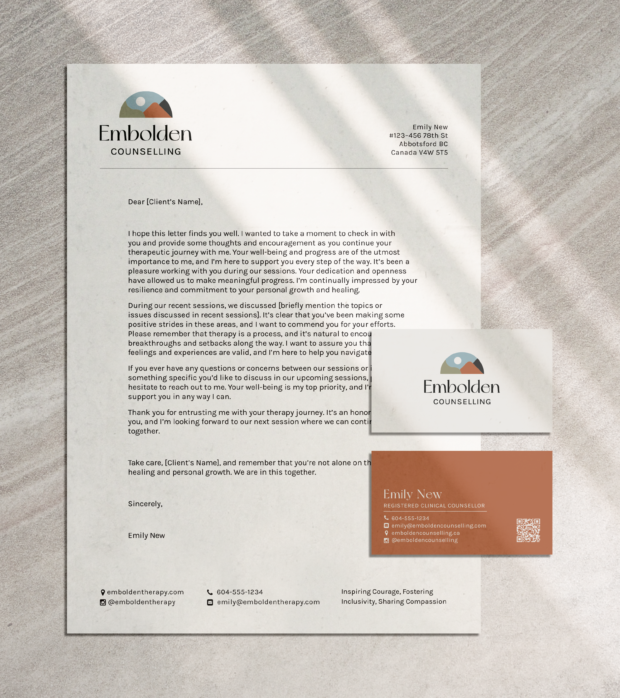
Embolden Counselling offers counselling in the Fraser Valley and remotely, with a mission built on empowerment, inclusivity and individuality. Their name and mission are vibrant, so they needed a brand that felt approachable and still stood out.
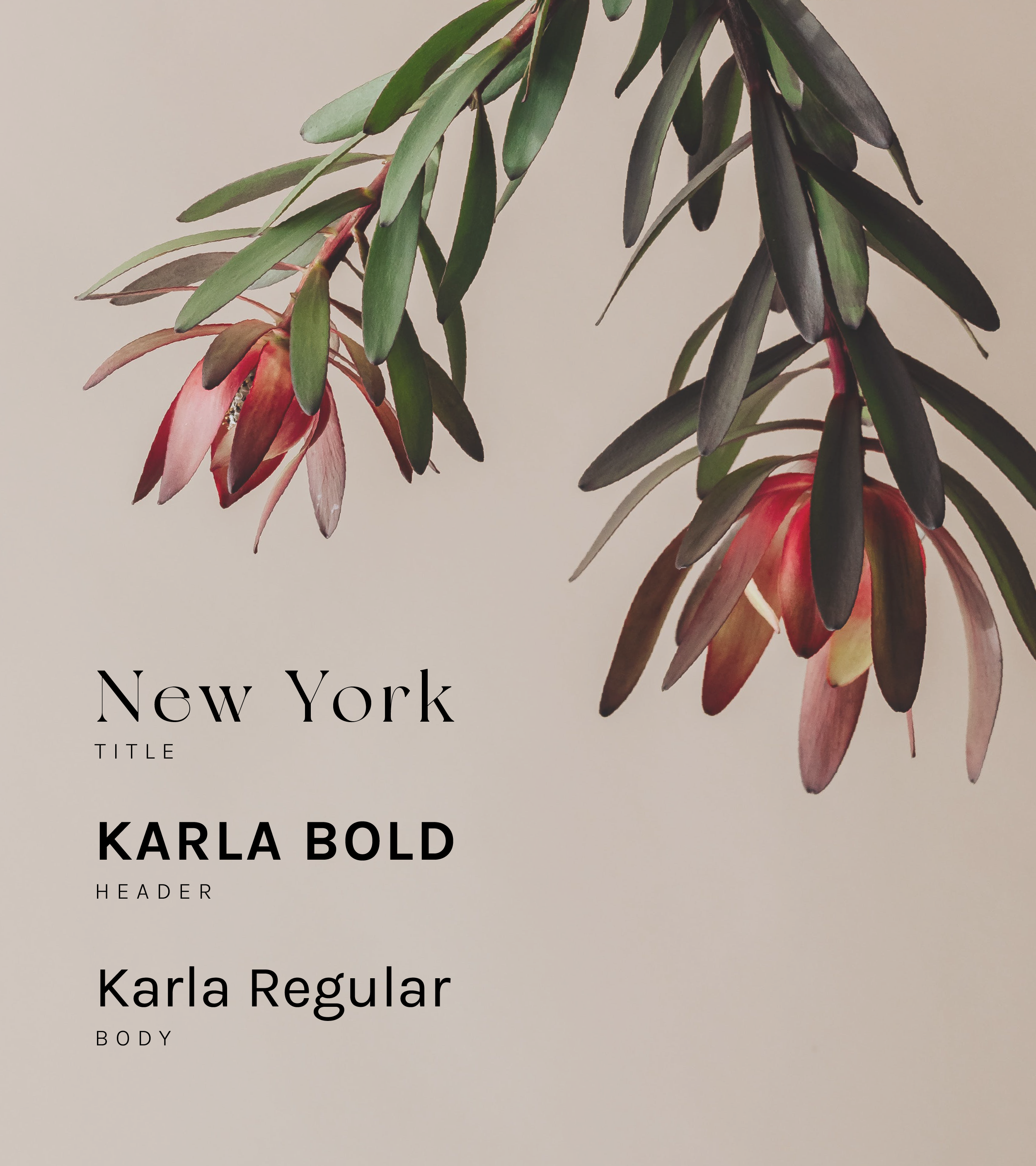
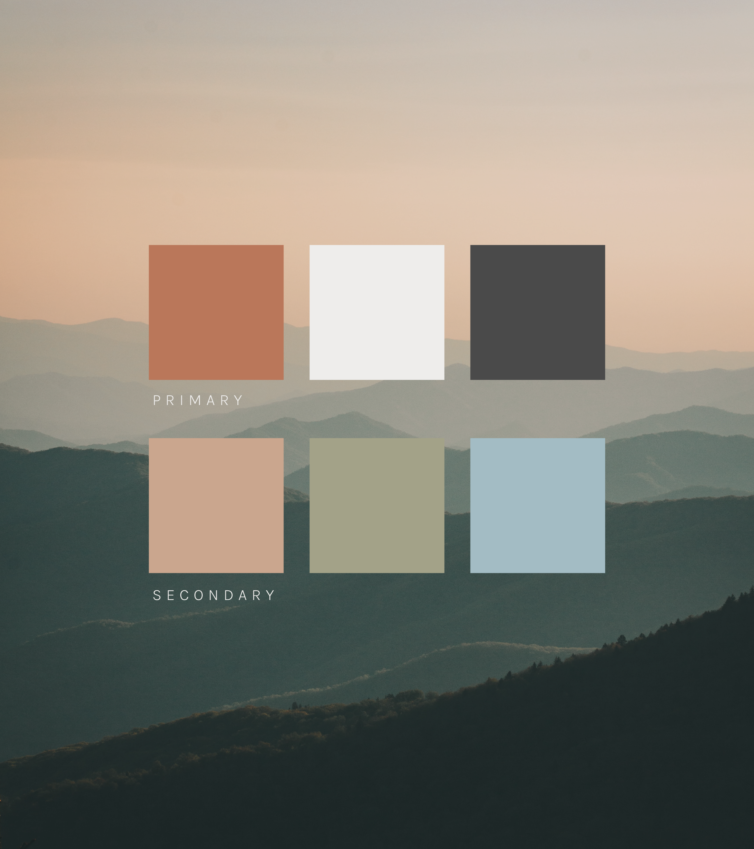
I designed an identity that's friendly and comfortable, with enough intrigue to make clients curious. Abstract shapes and colour blocking keep it modern, and the icon above the wordmark represents the Fraser Valley while staying abstract enough to move around and use in different ways. The palette is mostly neutral and calming, with a touch of warm clay to add brightness and joy.

Lamont Capital
2023
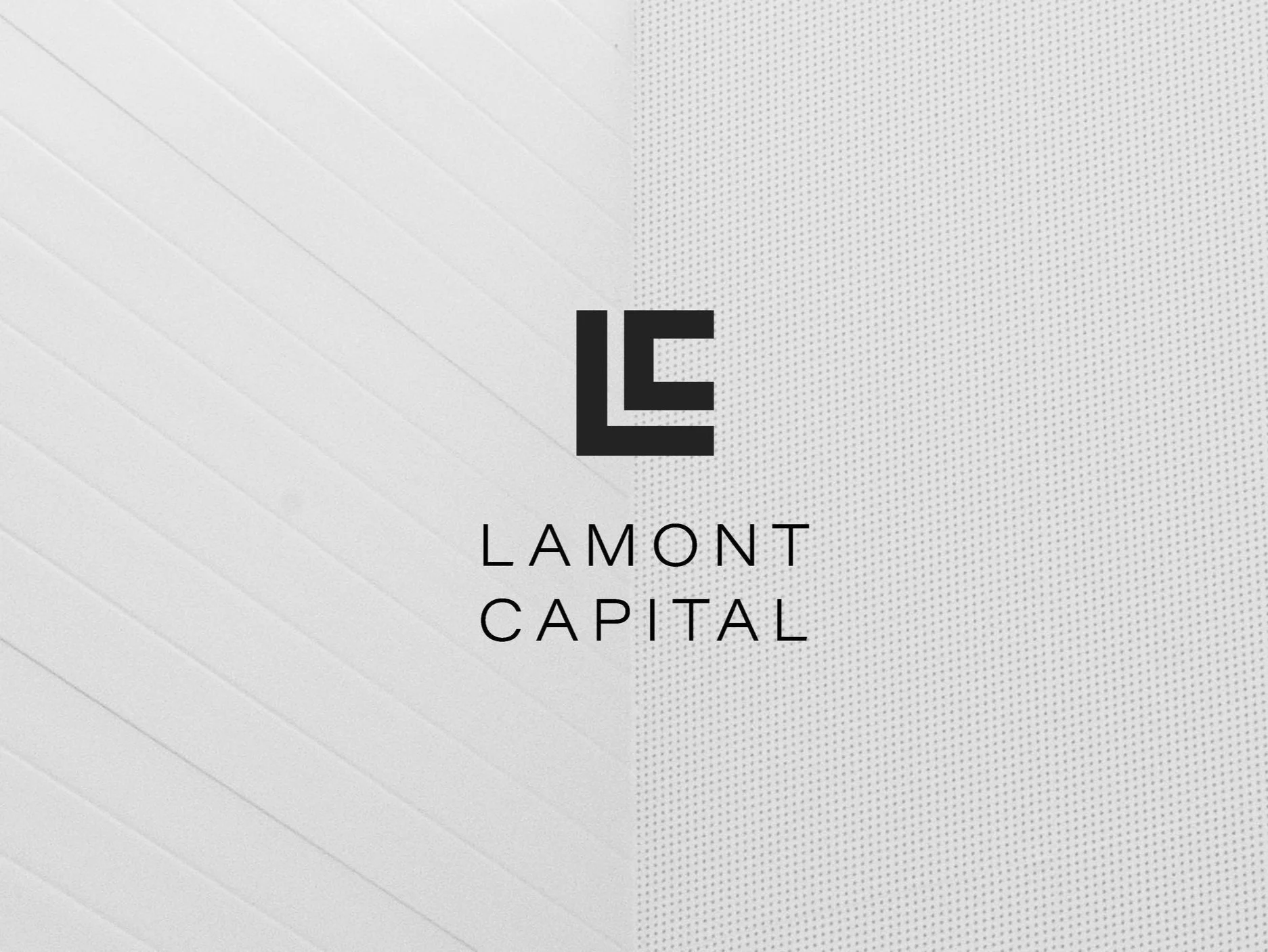
Lamont Capital is a financial consulting firm in the Fraser Valley that creates tailored financial solutions to help a range of companies succeed.
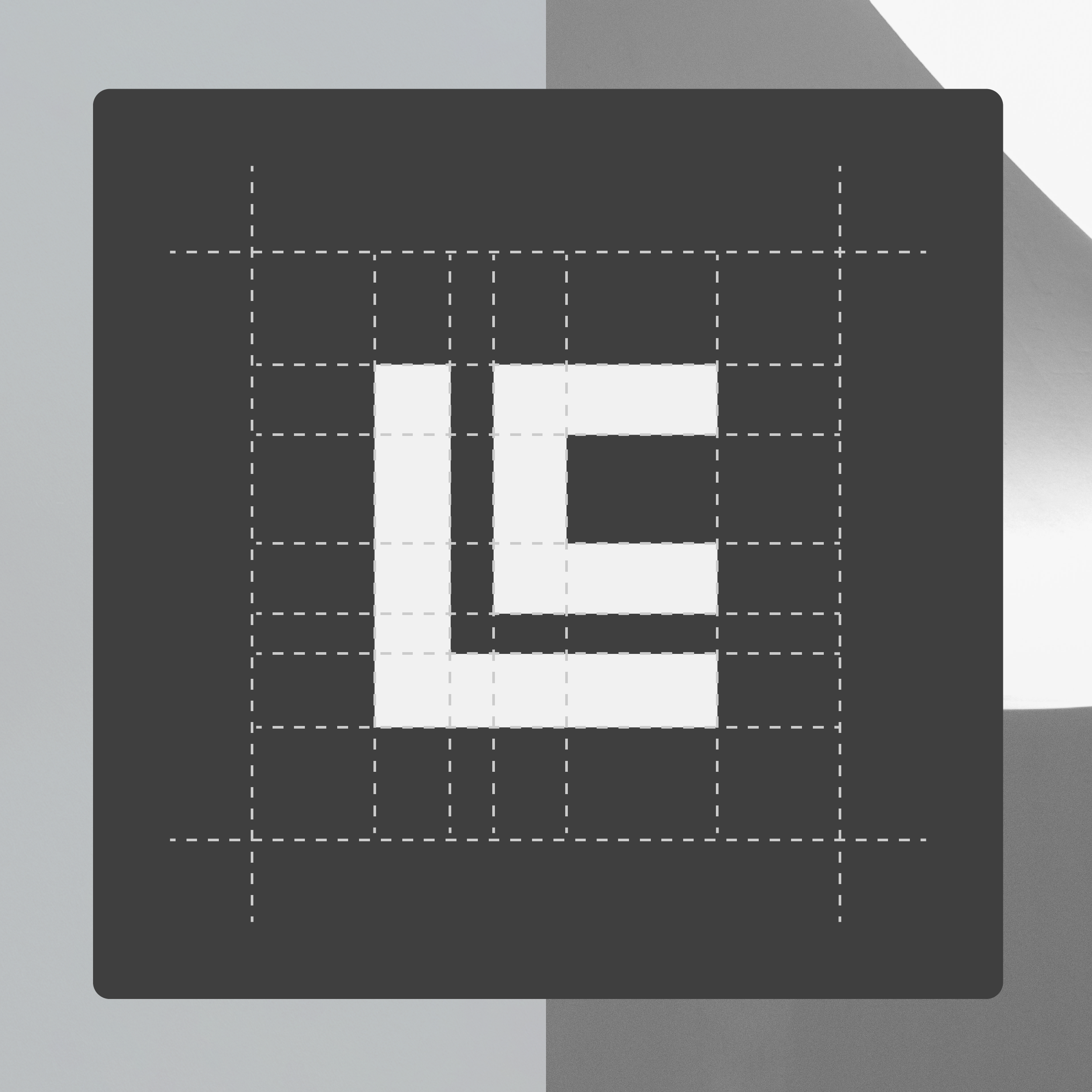
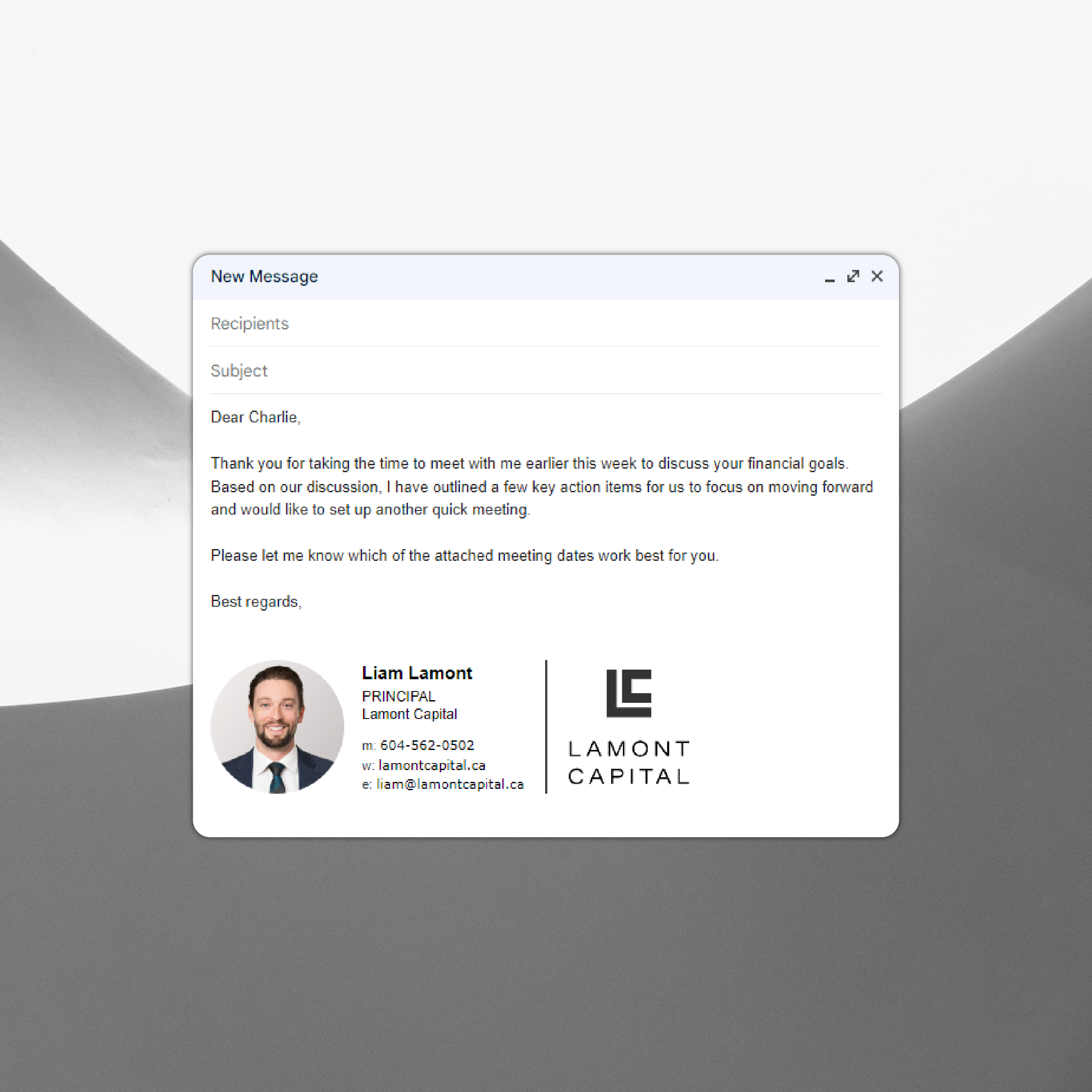
I designed their brand to convey sophistication and prosperity. The icon pairs an L and a C in a form that's elegant yet bold, set inside a perfect square to represent precision. Look closely and the logo also resembles a financial graph.


The Girls Next Door Pop Up Market
2025
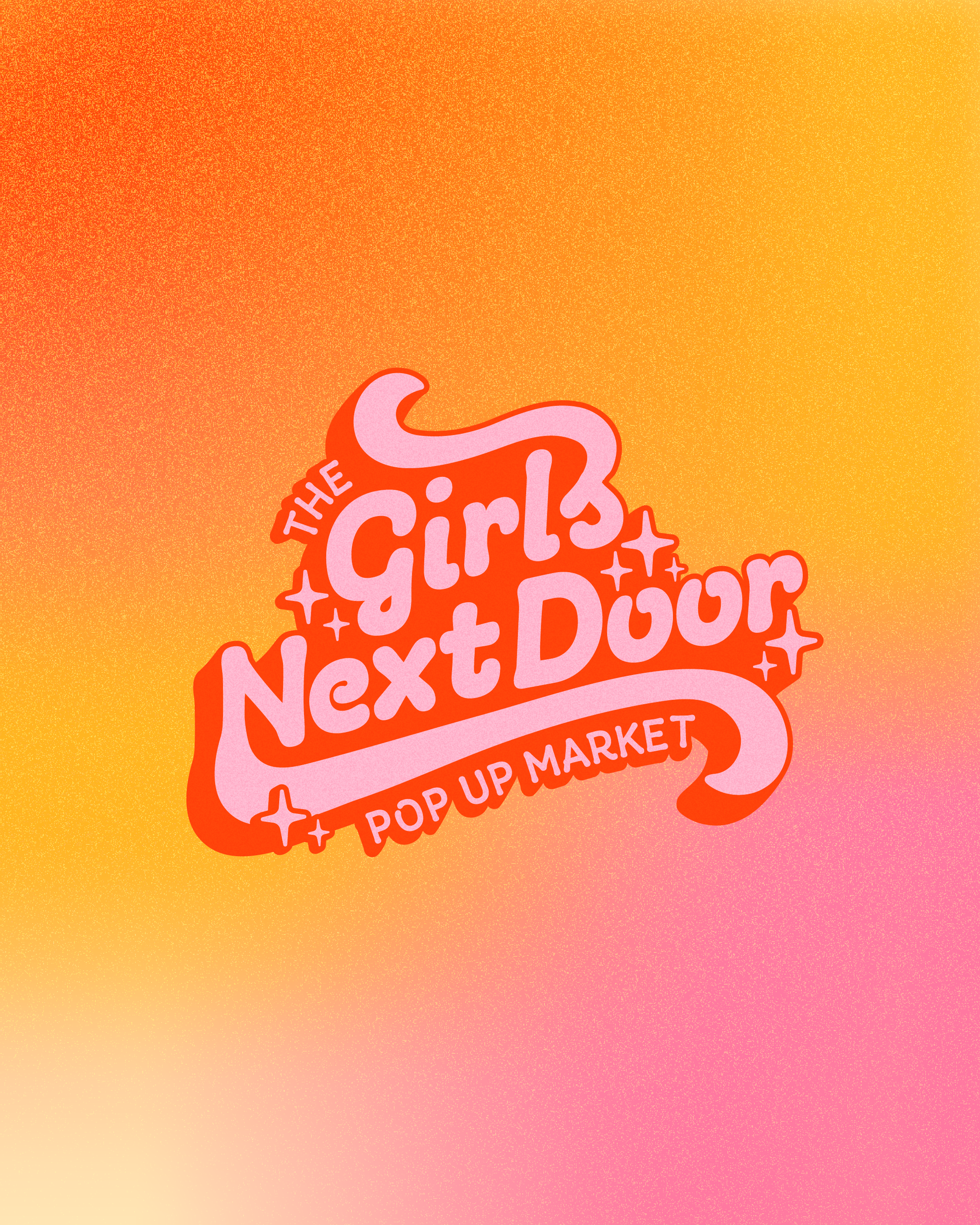
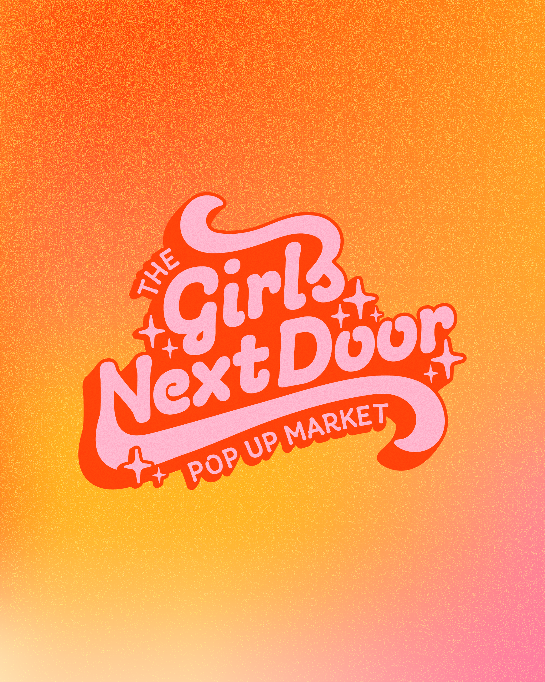
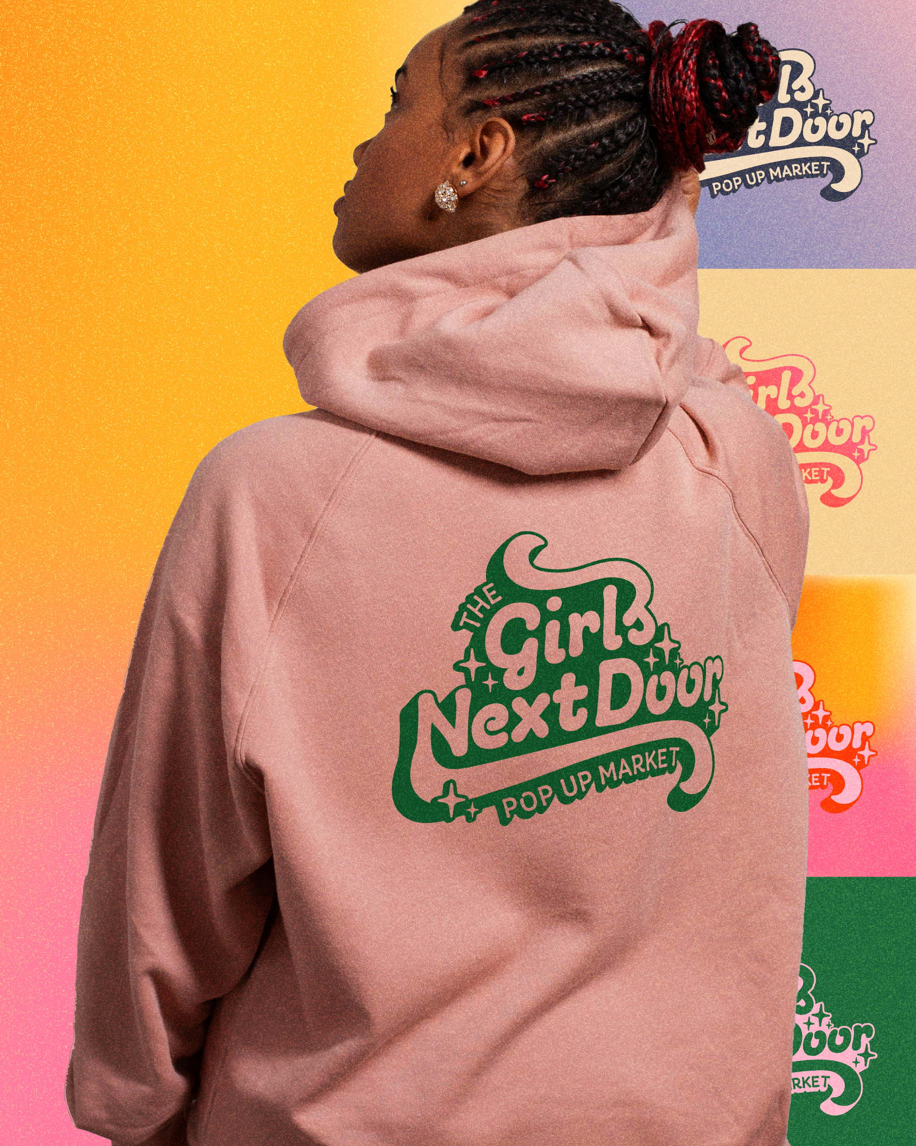
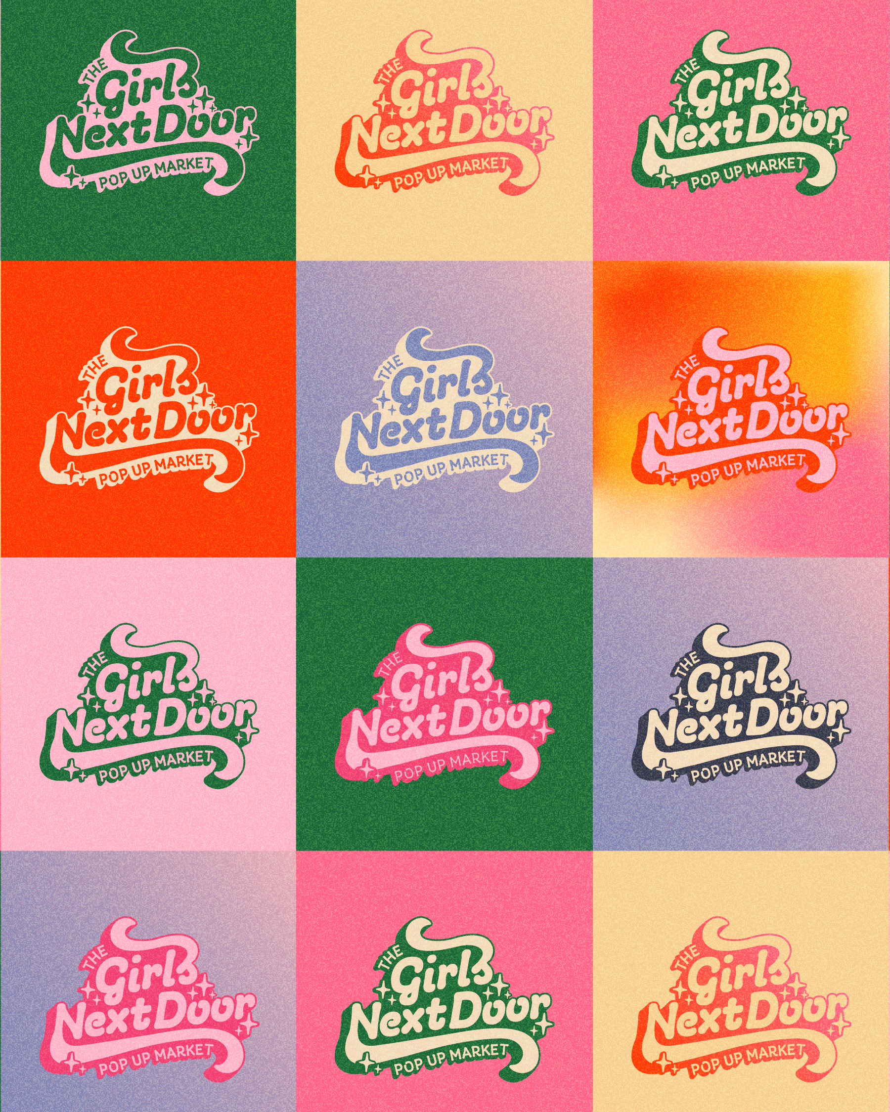
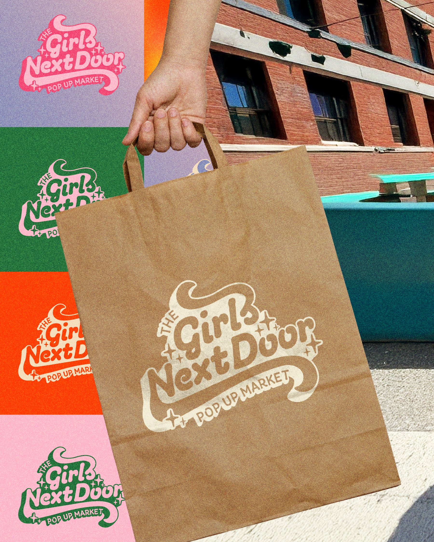
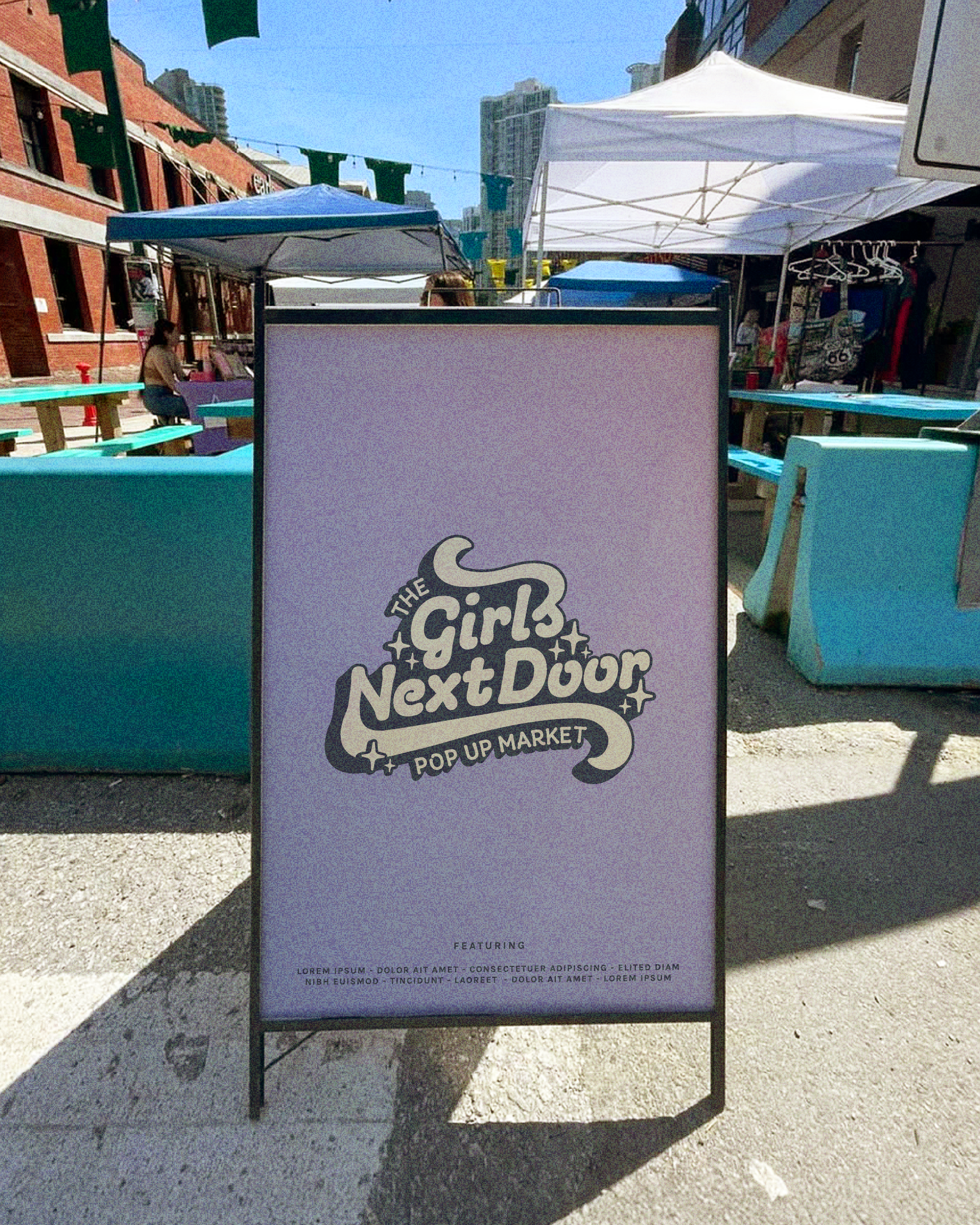
In 2025, I created the brand identity for The Girls Next Door Pop Up Market, a community market celebrating femme-led small businesses. Retro-inspired typography and a vibrant, playful palette make it feel welcoming, confident and easy to recognize at a glance.
Markets are busy, so the flexible logo system was designed to stand out and to hold up across signage, merchandise and digital platforms. It captures the energy and community-first spirit of the market.