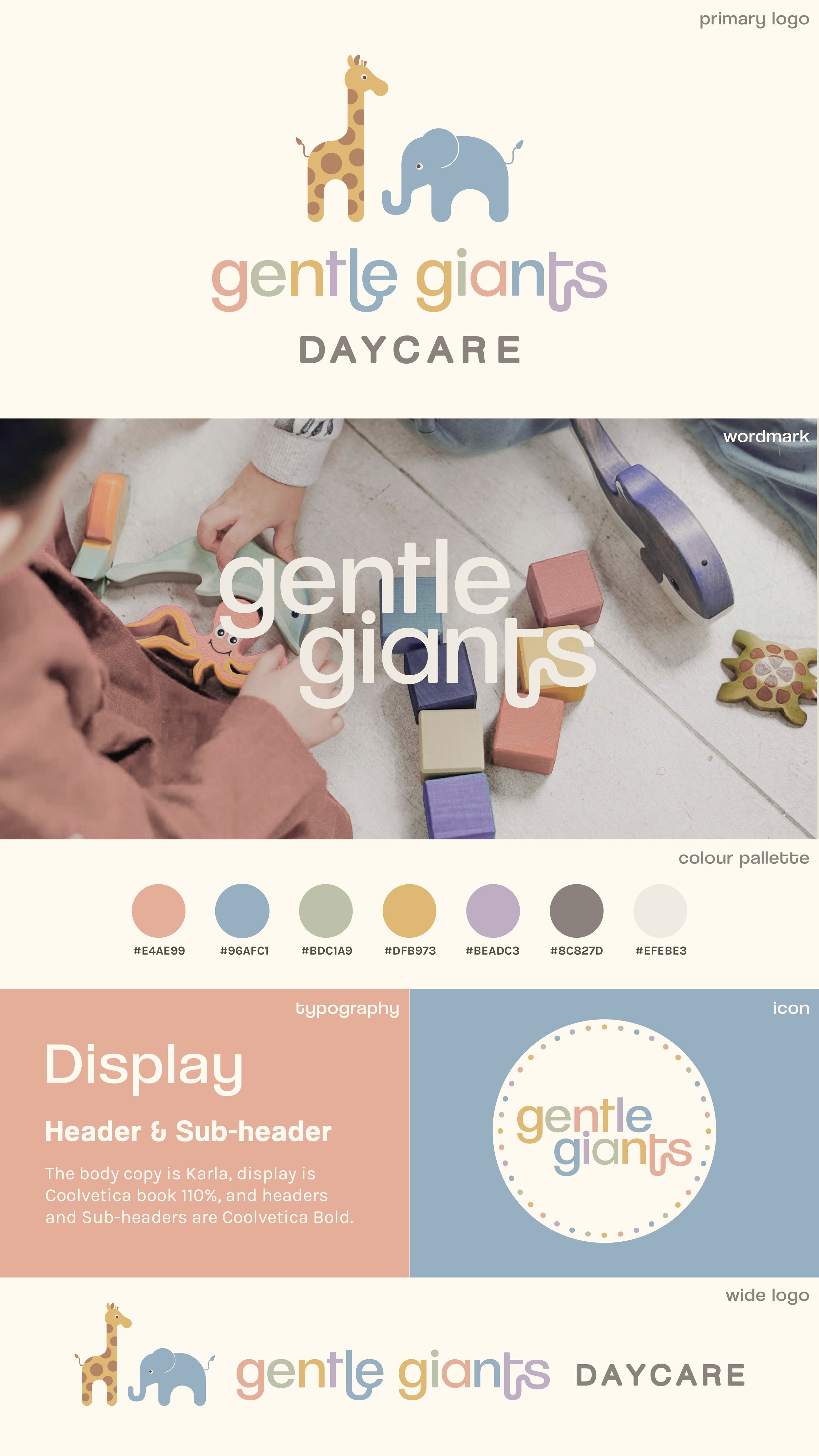
Brand Identity
Gentle Giants Daycare
2024-2026

Early 2024, I was tasked with creating a brand identity and preparing essential documents for childcare provider Gentle Giants. They wanted something earthy and delicate, capturing the warmth and nurturing environment they provide for children.
The Gentle Giants brand reflects a welcoming, serene space designed to engage children in a calm yet vibrant environment. The brand symbolizes the daycare’s commitment to structured growth and thoughtful care, emphasizing the importance of each child’s development.
I have since designed several marketing materials and a website for Gentle Giants. Please follow the link below to view the website.


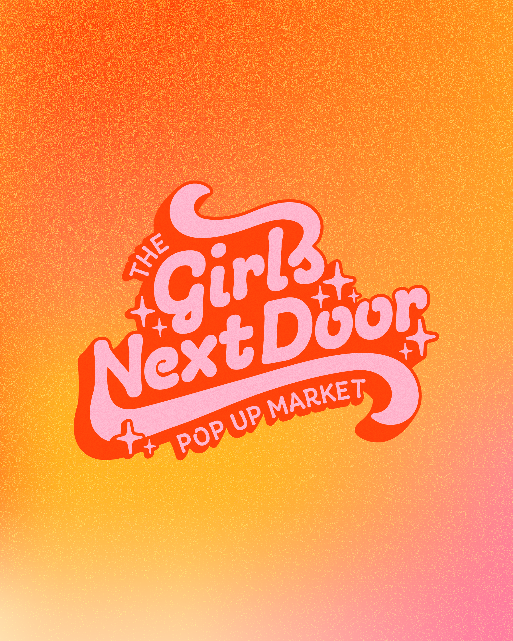
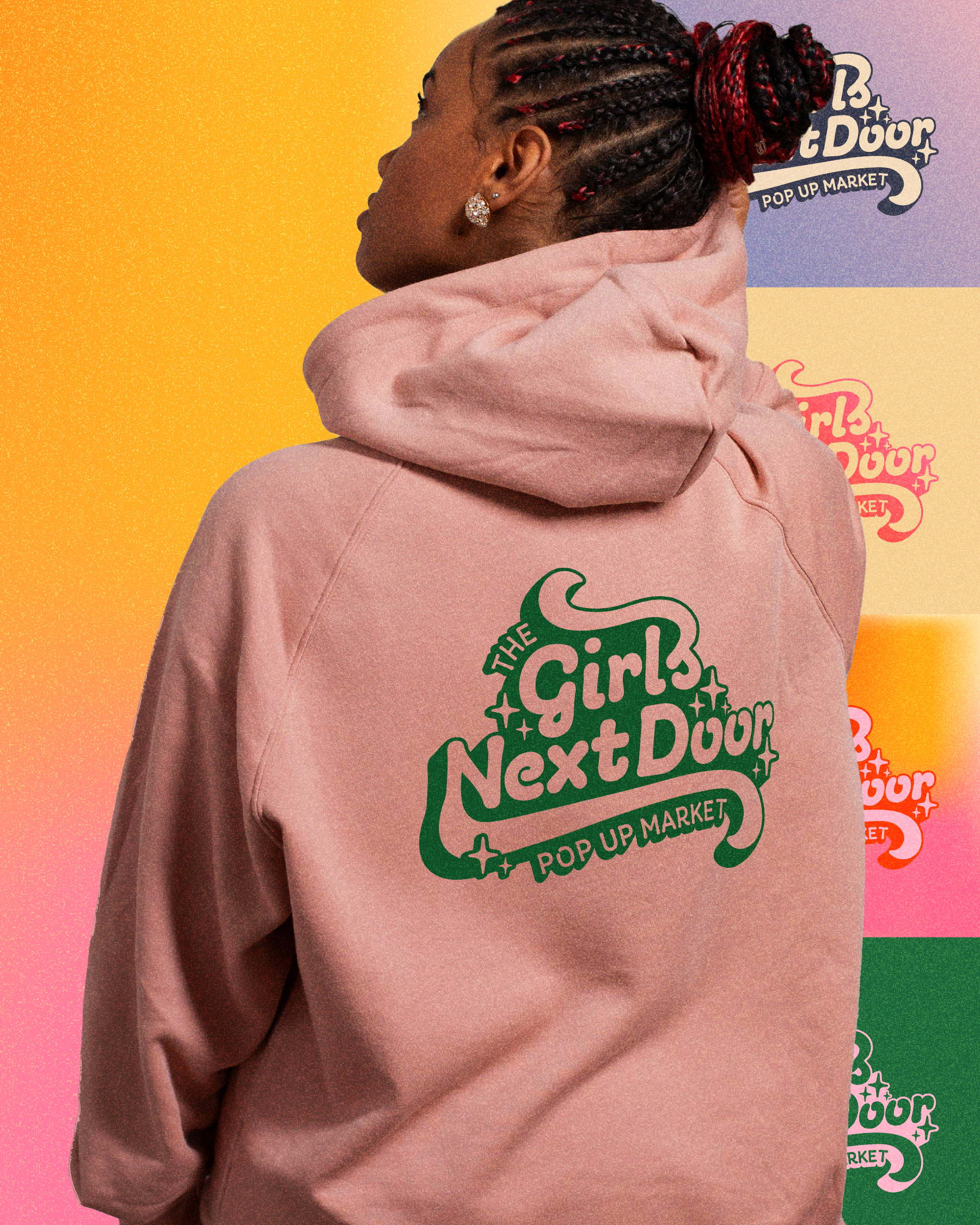
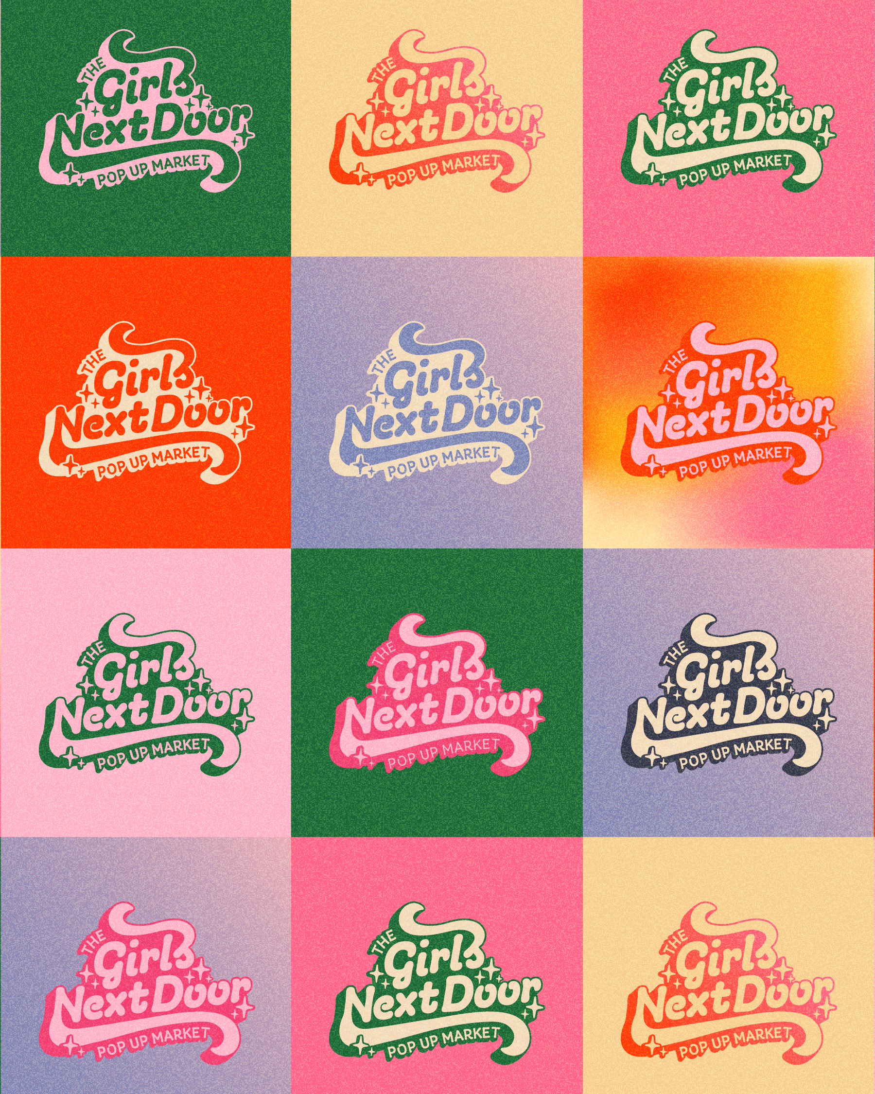
the Girls next door pop up market
2025
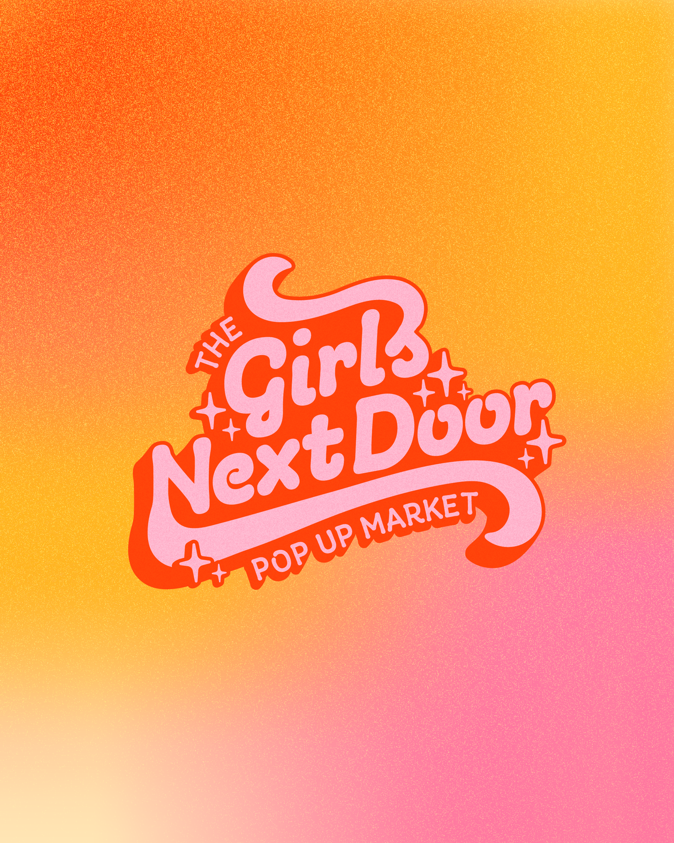
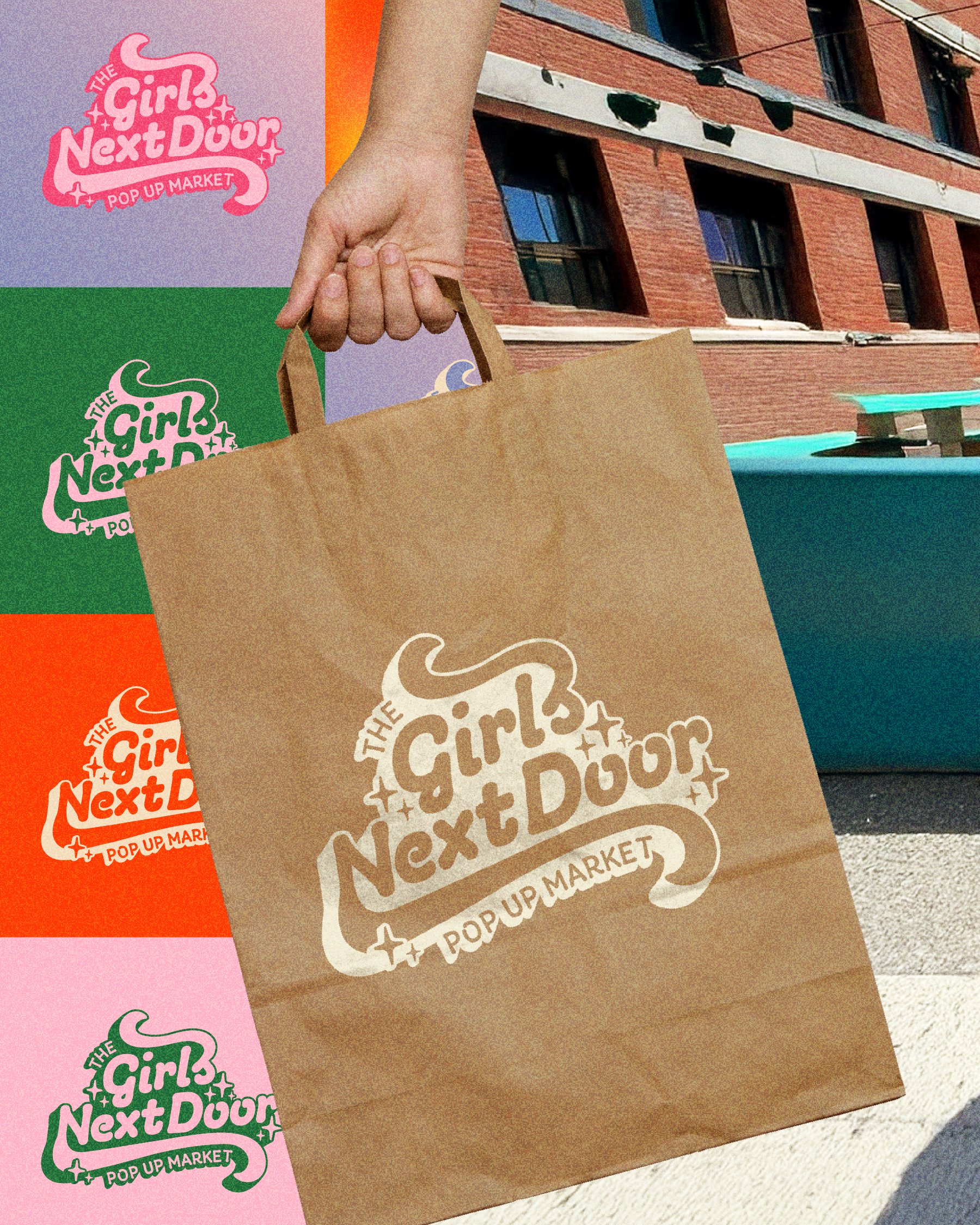
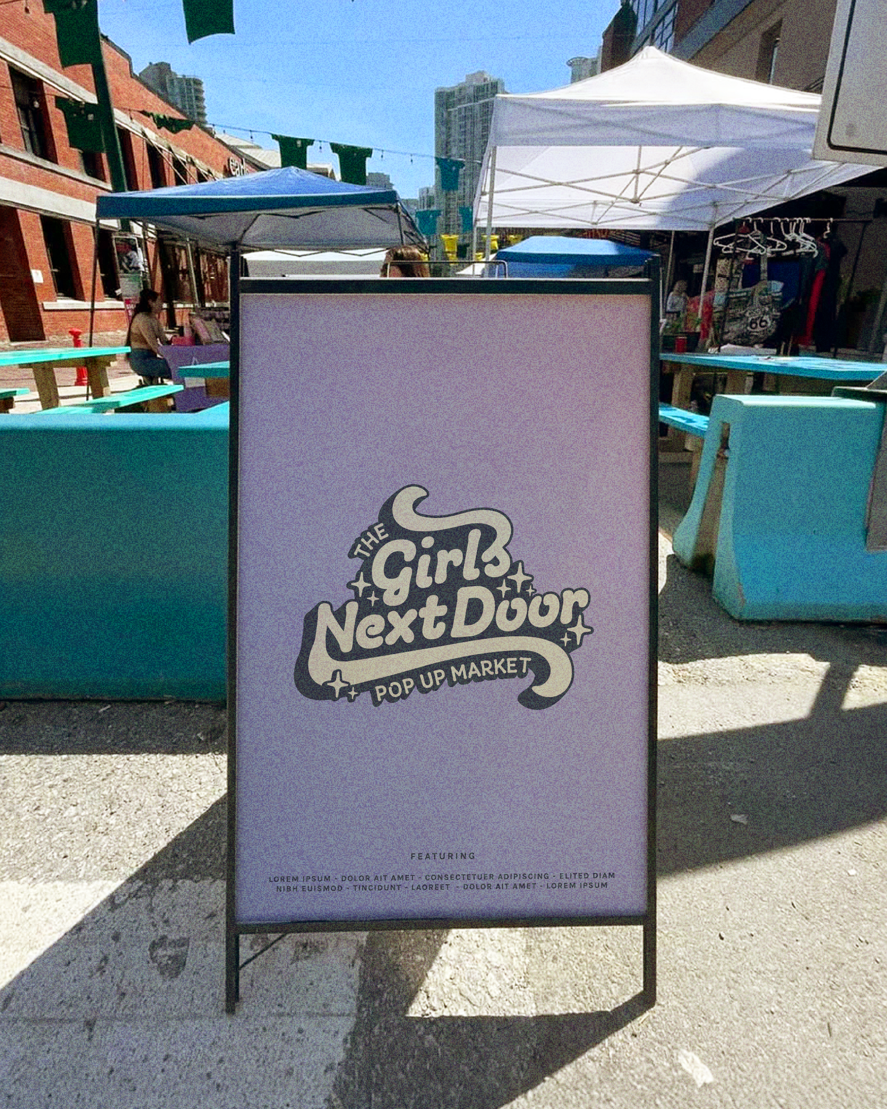
In 2025, I created a bold brand identity for The Girls Next Door Pop Up Market, a community-focused market celebrating femme-led small businesses. The identity combines retro-inspired typography with vibrant, playful color palettes to feel welcoming, confident, and instantly recognizable.
Designed to stand out in busy market environments, the flexible logo system works seamlessly across signage, merchandise, and digital platforms—capturing the energy, creativity, and community-first spirit at the heart of the market.
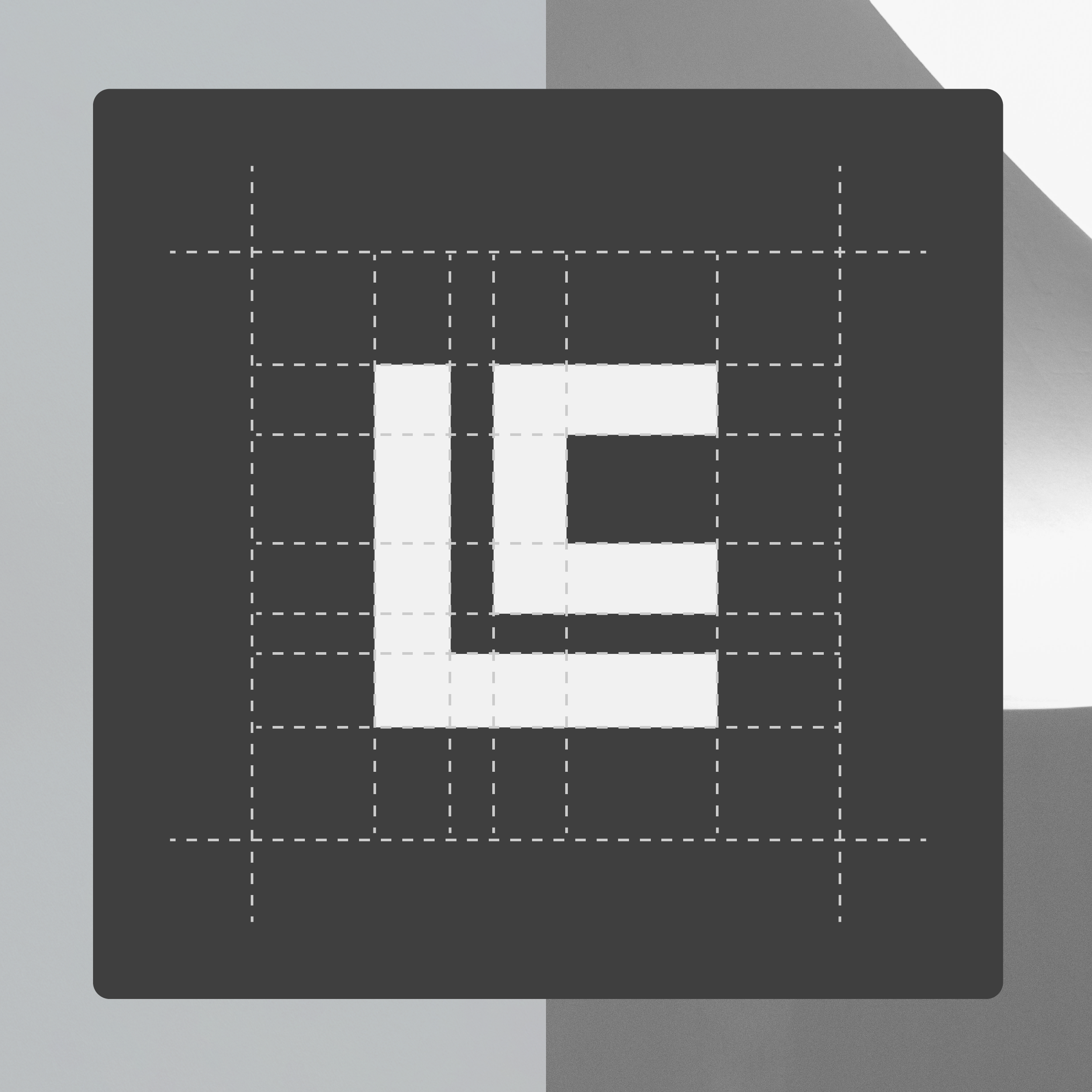
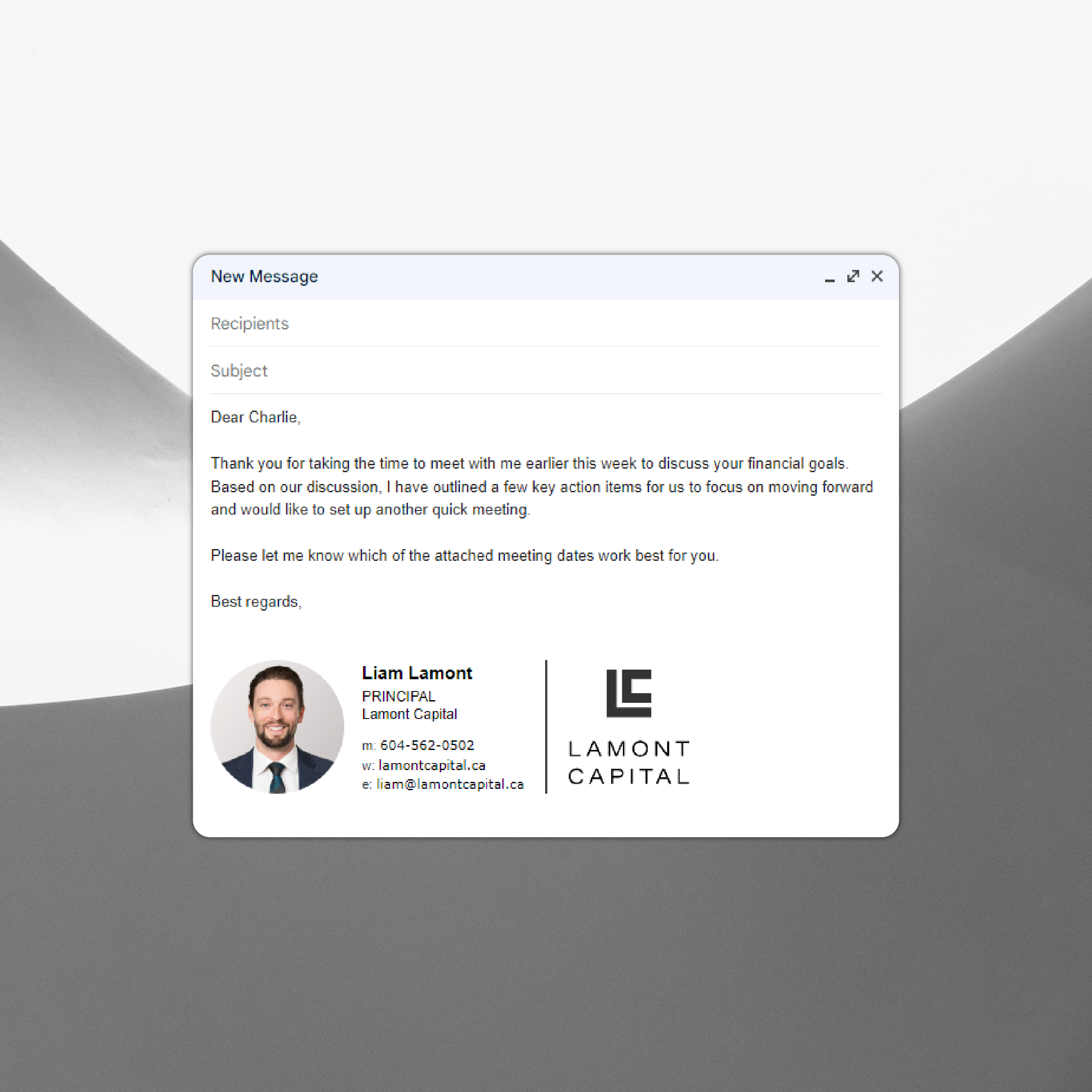
Lamont Capital
2023
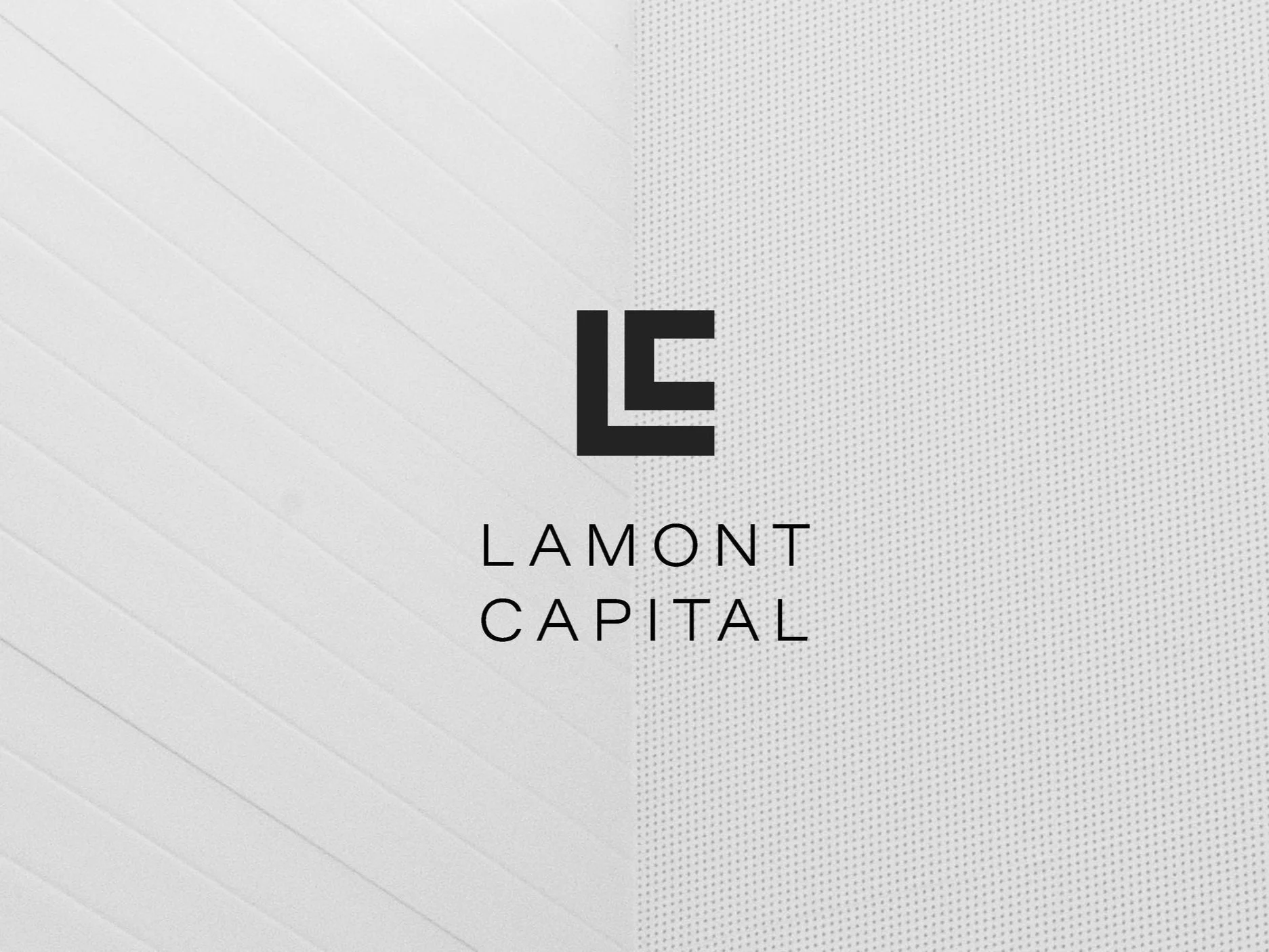
Lamont Capital is a financial consulting business located in the Fraser Valley. They help a variety of companies succeed by creating tailored financial solutions.
The Lamont Capital brand has been designed to convey a sense of sophistication and prosperity. The elegant yet bold L and C icon is contained in a perfect square shape to represent precision while also visually representing a financial graph.


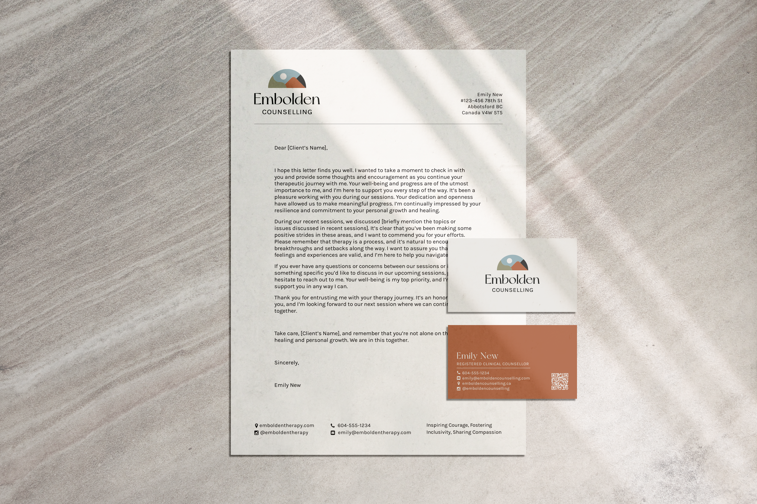
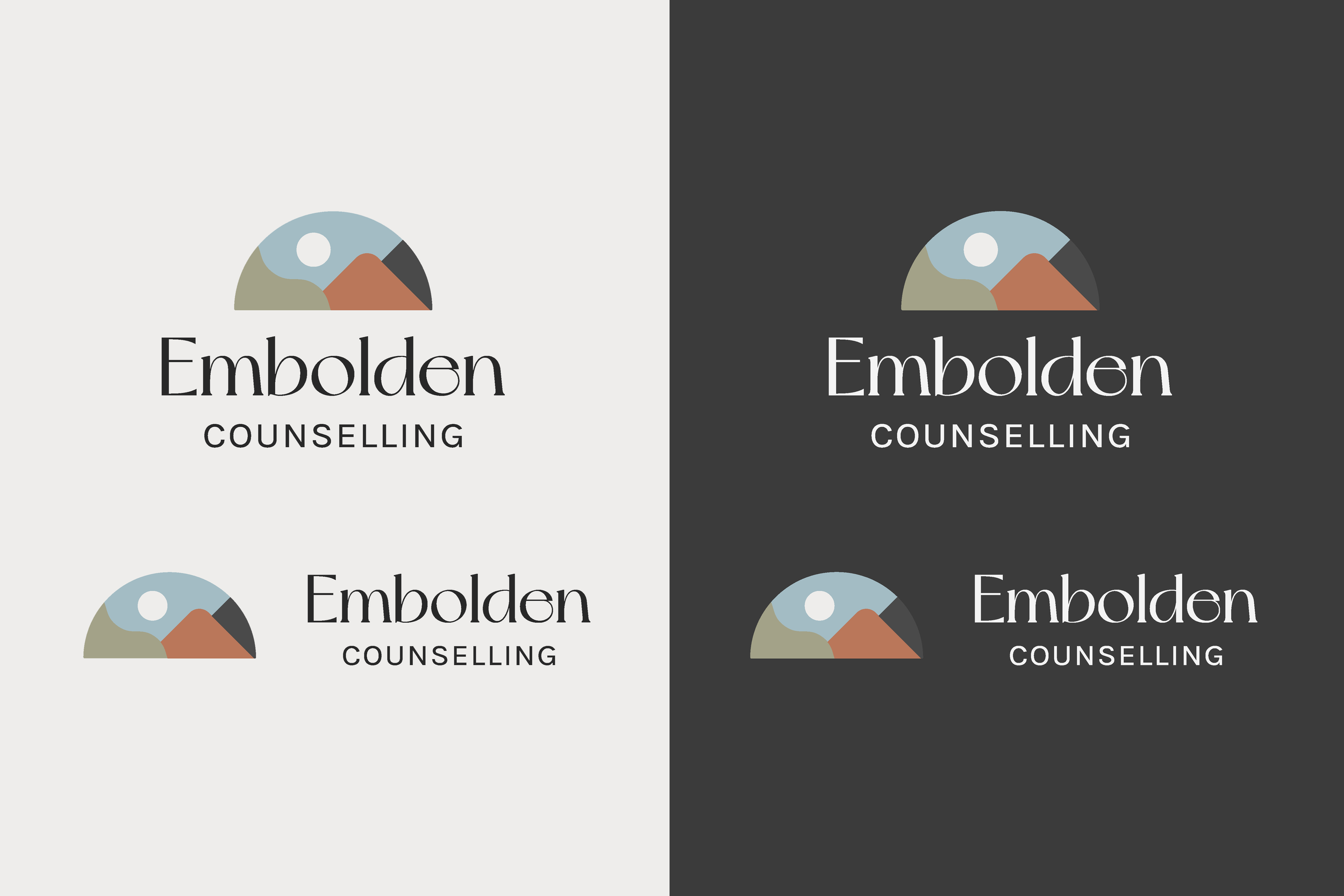
Embolden Counselling
2023
Embolden Counselling provides counselling services in the Fraser Valley and remotely. They hope to empower their clients and believe in inclusivity and individuality. Due to the vibrancy of the name and mission statement, they required an approachable brand that stands out.
The Embolden Counselling brand exudes friendliness, making the client feel comfortable yet curious. It uses a blend of abstract shapes and colour blocking to evoke a modern and approachable feeling. The icon above the word-mark represents the Fraser Valley, but is abstract enough to be moved around and used for a variety of purposes. The colour palette is primarily neutral and calming, with a subtle infusion of warm clay to add a touch of brightness and joy to the design.